
In the interest of exercising my coding skills, I have given myself a new task!
I have decided, I will be upgrading my social link page.
In May of last year (2023), I started working on Project CMN (Click here to read more), in which I wanted to finish working on my half baked ideas including building a link page that I could put on my social media pages and give out, to direct people to my different platforms and content. Unfortunately, not long after May a lot of stuff happened which caused me to rush my work on the link page and not complete it to a standard I was 100% satisfied with. So now let’s fix that.
What is the link page currently:
- Aesthetically bold
- Responsive to 2 screen sizes
- → and adapts to layout
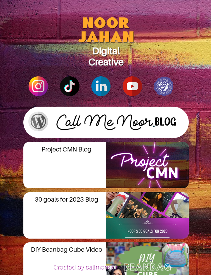
- Has links to other content (but can only update in the source code)
- 5 social links – one broken as I updated my username
- Boring “Continue to full site” button
- Boring WordPress blog button
- “created by callmenoor” not responsive to screen sizes and feels awkward
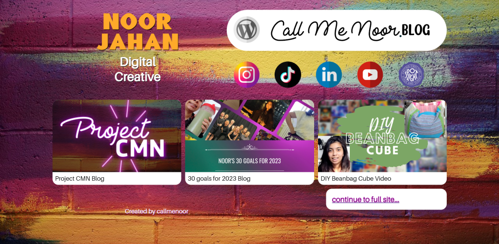
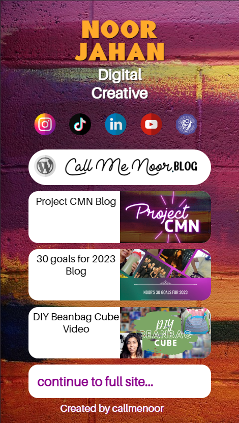
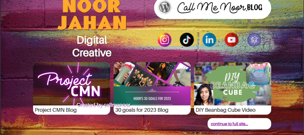
Here is a screenshot of what the website currently looks like and in the 2 screen sizes where the site IS responsive to. Anything slightly different makes the elements go a bit weird.
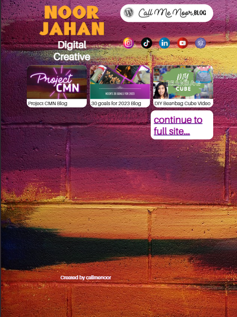
Here are the sizes where the site isn’t responsive.
So, what do I want from this link page?
💡 I don’t ever want to touch the source code again, unless to fix bugs or to incorporate a new element. I want the social links and online content to update from a database which I can then turn into an interface of some kind that allows Easy Content Manipulation.
💡 Next level responsive to different device sizes. Like, Excessively Responsive because if i can’t make a link page with 10-20 elements crazy responsive to screen sizes, how will I be able to make a full company site responsive to screen sizes (my big dream there).
💡 I think I definitely need a Lesson in Typography and Design before the final draft of this website. The buttons i designed are very plain for something that is meant to “entice” the user to move to the next level and I definitely hurried the fonts I used all over. Mostly for my name and title which should be the grandest part of the site. I’m clueless when it comes to fonts and found it hard to find ones I liked that also fit the style of this page.
When it comes to a link page, you don’t want it to be the last place a user goes. You want it to keep the user moving through your content and be fascinated by all the cool links, maybe get them to click something they just found.
I want mine to almost be a Digital Business Card of sorts. I want to send people to this link and have them see all the cool stuff I do and want to get involved. Interact with my content, participate in things I may be doing and/or hire me to help them do those things for them. To say I also built my links page and to have it be “pretty impressive” also, would be a very good sell if I wanted to show what I was capable of and potentially convince someone else of hiring me to make them one.
To do this, I will be taking the 3 goals listed in this post (Easy Content Manipulation, Excessively Responsive and A Lesson in Typography and Design) and focusing on them one by one to achieve this closer to perfect link site. Starting with Easy Content Manipulation. I will take the original source code and upgrade it to allow for ECM and then brainstorm how I want this to work moving forward, either with a separate application or create an admin page on the site to do this on one platform. Nonetheless, I will be taking it one step at a time.
Thank you for reading! I’m excited to share the rest of my journey and the final product(s) with you!
